
Condoit
A tablet app that moves electrical audits from paper to a digital workflow.
Inherited: The goal of digitizing electrical audits and a black-and-white wireframe that didn't work.
Designed: The single-line diagram builder concept, a new information architecture, and an interface built for field conditions.
Impact: The redesign became Condoit's sellable product and contributed to the company raising $2M.
Electrical auditors were used to paper and manual note-taking, and many were between 40 and 60 with limited tech experience. The existing app moved them through a linear, page-by-page flow of dense, hard-to-read forms, and unnecessary pages added frustration. They needed a digital tool that felt closer to their paper process.
Problem
Role
UX Designer
Team
1 Product Manager, 1 Designer, 5 Engineers, and 1 Product Marketing Manager
Timeline
Incremental updates over 4 months
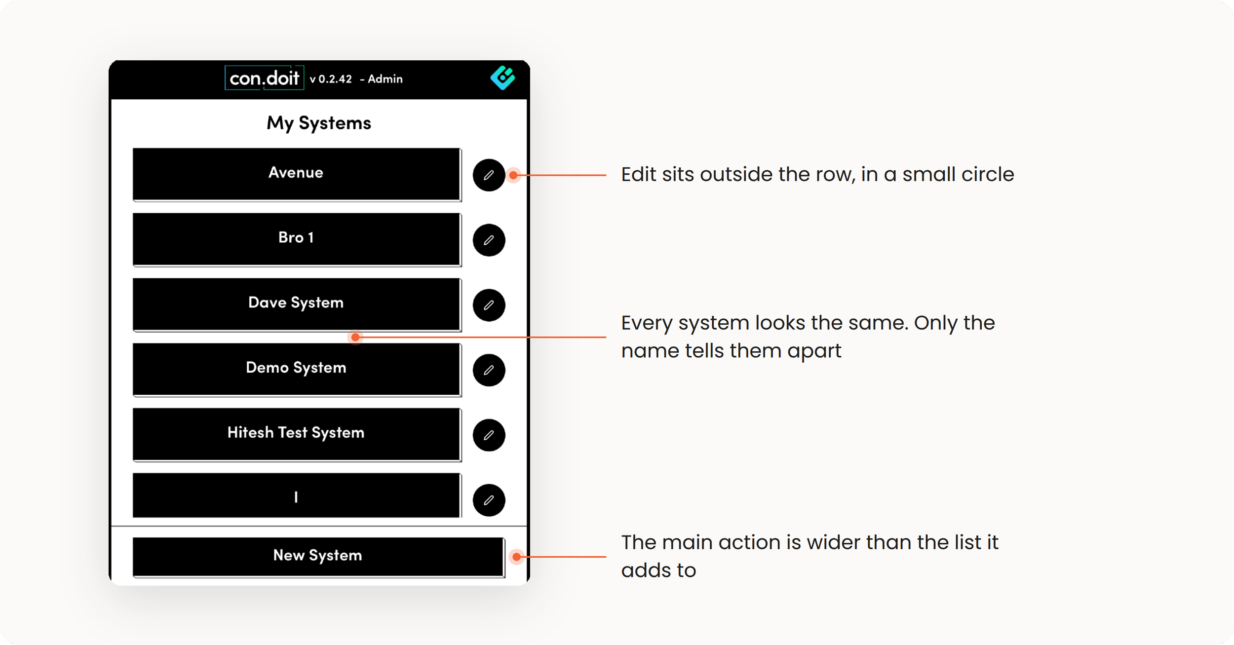
The original tablet app had a complex, visually inconsistent interface, unnecessary pages that frustrated users, and navigation that confused people with limited tech experience.
Starting with the existing application
Research: Leadership and Users
I started with the CEO and CMO to understand the platform, the users, and what the redesign had to achieve. Their goals were to improve usability, add features for users' evolving needs, simplify the user journey, and make the move from paper smooth. Leadership also wanted the app to feel more polished and aligned with the brand.
Three findings set the direction:
Who: Users were 40 to 60, with limited tech expertise, auditing with handwritten notes.
Risk: Moving from paper to a digital tool would be hard for them, and the team wasn't sure the current flow worked at all.
Need: An interface that mirrors paper-based workflows.
Testing the open question
The unknown was whether the current flow worked, so I ran usability tests with 8 electrical auditors, observing them use the existing app. The tests surfaced the pain points that shaped the redesigned user journey and information architecture. We also ran workshops on how electrical systems work, so design decisions would hold up in real audits.
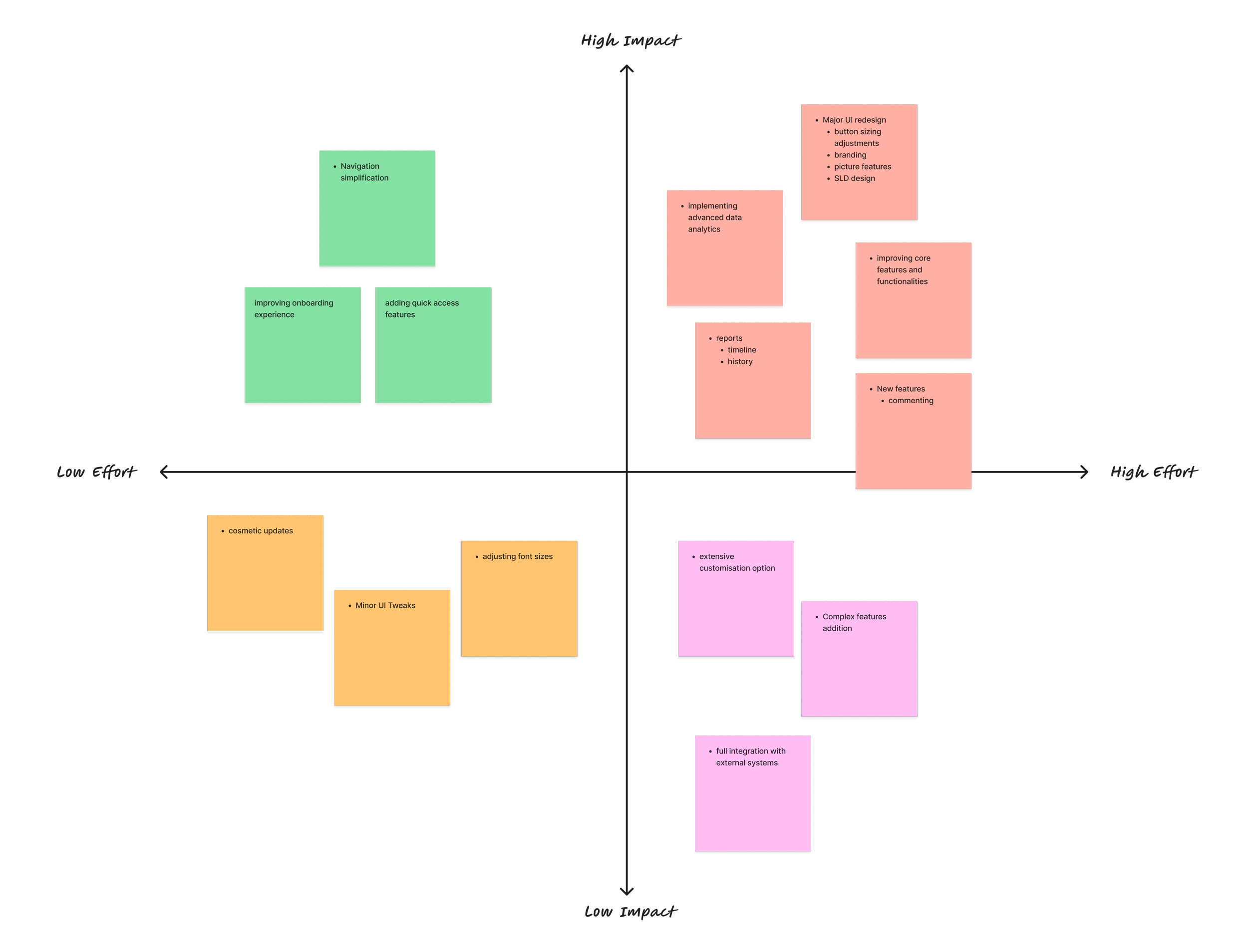
Key Decisions
Three findings shaped the decisions below.
Users were 40 to 60 and worked on paper. They needed an interface that mirrors paper-based workflows, so I designed the builder as a canvas where auditors place and connect equipment.
Auditors worked in the dark, often with gloves on. I designed large touch targets and full-width buttons.
Unnecessary pages frustrated users. I removed redundant pages and moved a multi-page, multi-click task onto one page.


1. A single-page diagram builder
2. Designed for gloves and low light

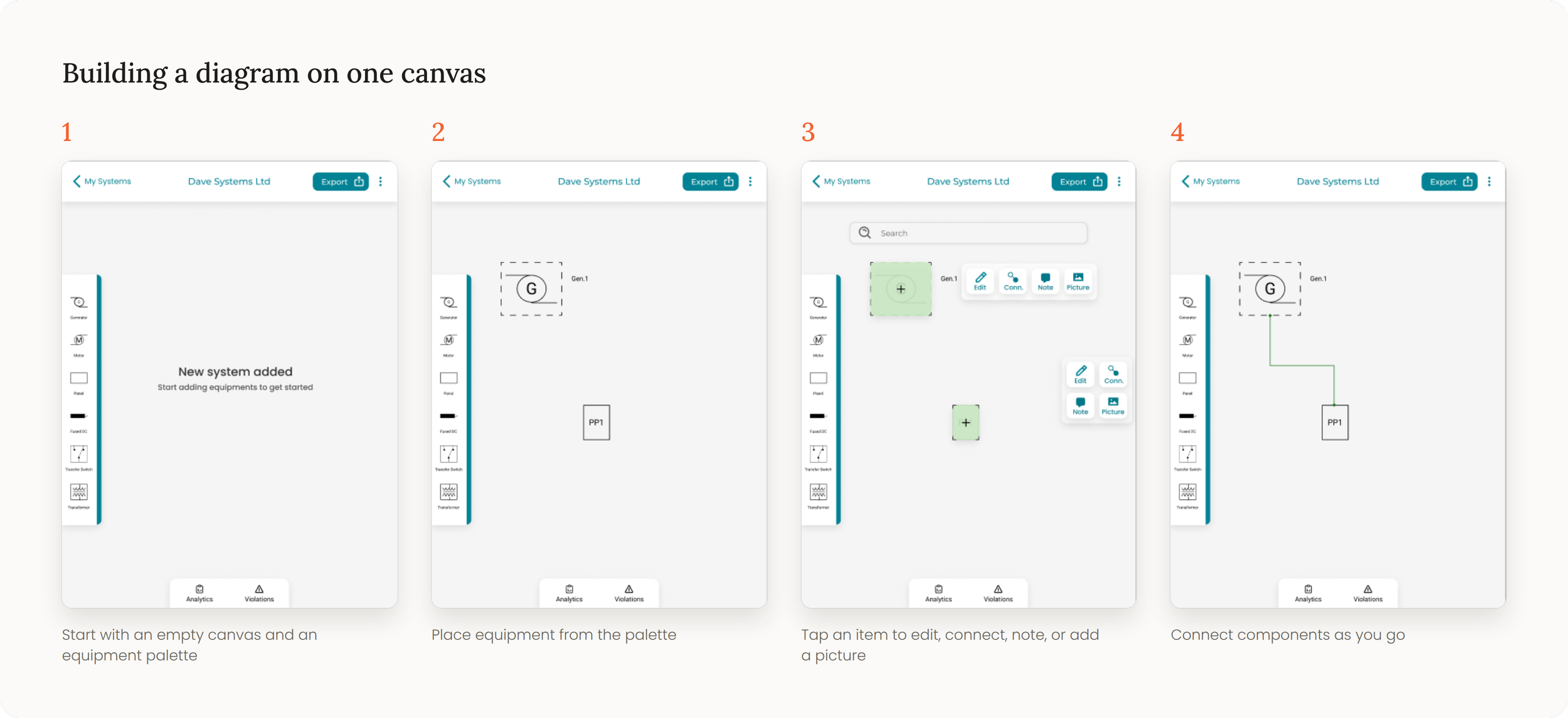
The original flow was linear. Auditors added equipment by category, then filled in a separate form page for each piece. I replaced it with one canvas. Auditors pick equipment from a palette and place it, tap an item to edit it, connect it, add a note, or attach a picture, and connect components as they go.
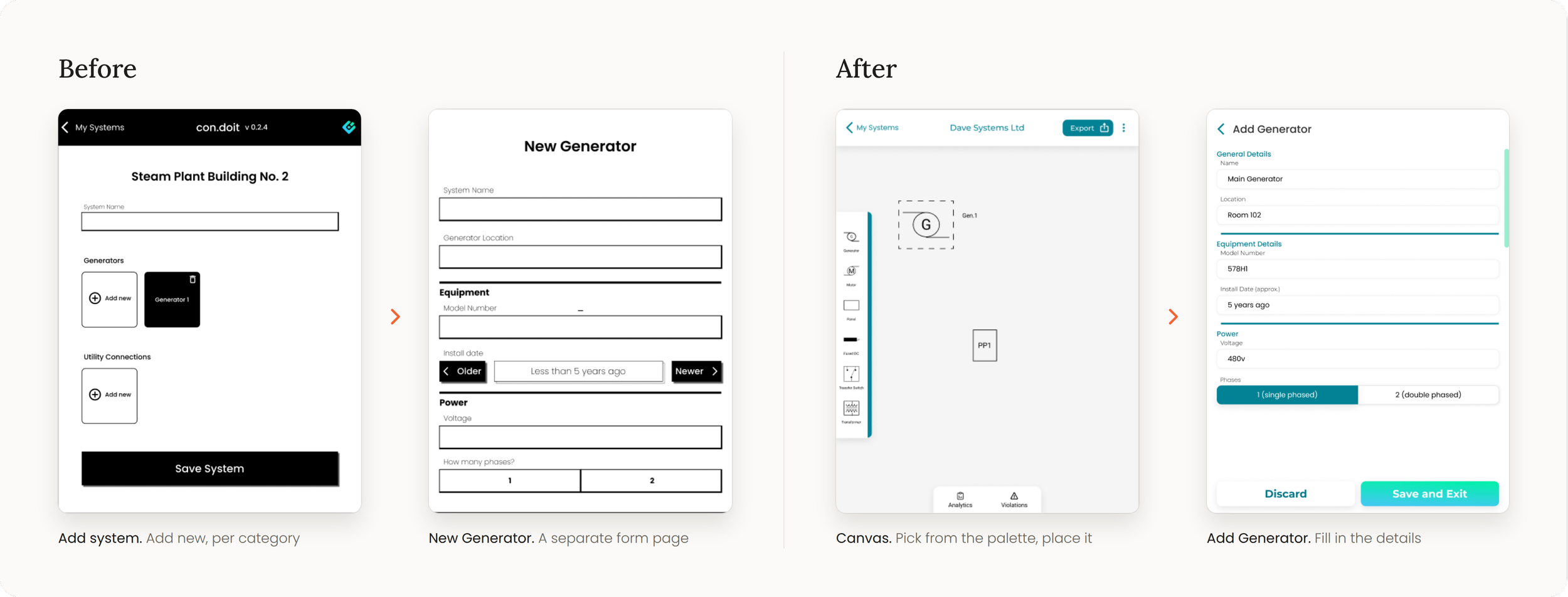
Adding a generator, before and after: from a category list and a form page to placing it on a canvas.
Auditors work in the field, in the dark, often with gloves on. I designed large touch targets and full-width buttons so the app works under those conditions.
3. A shorter, clearer journey
I removed redundant pages and moved a multi-page, multi-click task onto one page. I applied a cohesive color palette and clear visual cues to fix the visual inconsistency. I also added image upload, zoom for single-line diagrams, and full document history.
Outcome
The redesign became Condoit's sellable product and contributed to the company raising $2M.
Reflection
Gloves and low light changed the design more than visual polish did. Every choice had to be tested against how auditors actually work.