Redesigning Canvas:
A Dashboard That Works
With Students
Most students don't fail because they're not trying. They fail because the tools they rely on make it harder to succeed.
This is a redesign of the Canvas LMS dashboard — built from research, tested with real users, and focused on three things: making critical information glanceable, reducing the overwhelm of starting assignments, and connecting coursework to purpose.

Role
Solo UX Researcher & Designer
Timeline
7 weeks · Fall 2025
Methods
Heuristic eval · Literature review · Task analysis · Usability testing
Target
College & graduate students
Device
Desktop
Tools
Figma · Fig Make · Zoom

01 The Problem
Students are spending time managing Canvas instead of learning.
Over 30 million students use Canvas daily. For most of them, it's the first thing they open in the morning and the last thing they check at night. But through observation and secondary research — including NNG's F-pattern eye-tracking studies and academic research on student cognitive load — I found that students were spending significant time searching for basic information that should have been immediately visible. Zoom links, class recordings, and upcoming assignments. These are high-frequency, time-sensitive tasks. The friction accumulates across an entire day.
What would Canvas look like if it were designed around how students actually spend their day?
Following a student through a full academic day
02 Research
Understanding what students actually experience.
To understand the problem, I used three methods, each building on the last.
1.
Secondary research
I reviewed academic papers and NNG research focused on student engagement, cognitive load, task initiation, and learning motivation. Three patterns kept surfacing: students struggle when frequently needed information requires excessive navigation; students often know what needs to be done but don't know how to start; and students are more motivated when they understand how their coursework connects to real-world outcomes.
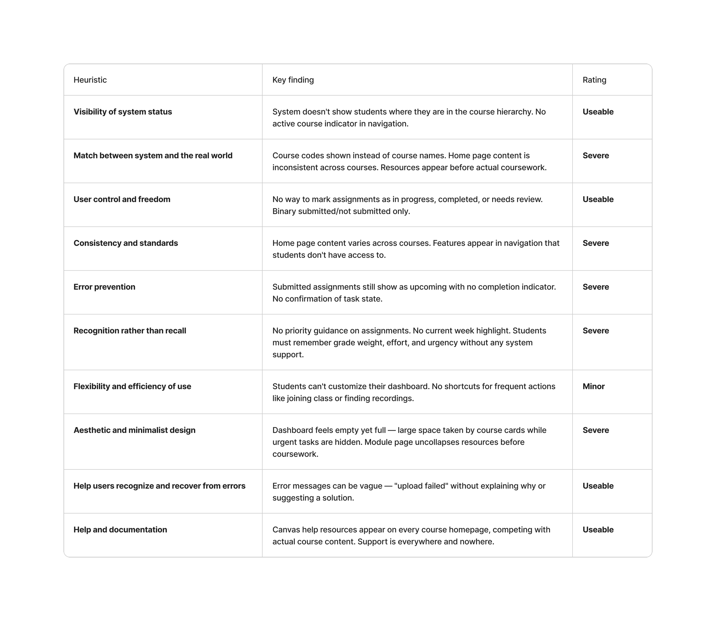
Heuristic evaluation
I evaluated the existing Canvas interface against Nielsen Norman Group's 10 usability heuristics, using a realistic task scenario: find and submit a week 3 assignment. Six of ten heuristics had identifiable violations. Four were rated severe — meaning the task could not be completed without significant difficulty.
2.
Task analysis
I traced the full click-by-click flow for the most common student actions, documenting every decision point, dead end, and moment where the system required students to remember information it should have been showing them.
3.
03 Key Findings
Three issues. Rated by severity and impact.
Finding 1:
🟥 Severe — Critical information is not glanceable
Students were spending time navigating Canvas to find basic information that should be immediately visible.
Zoom links and recordings required 3–4 clicks to locate, so students messaged classmates on Slack instead of using Canvas.
What I changed: I added Join Live Class and View Recordings directly on every course card, reducing 3–4 clicks to one.
Violates Flexibility and Efficiency of Use - NN/g Heuristic
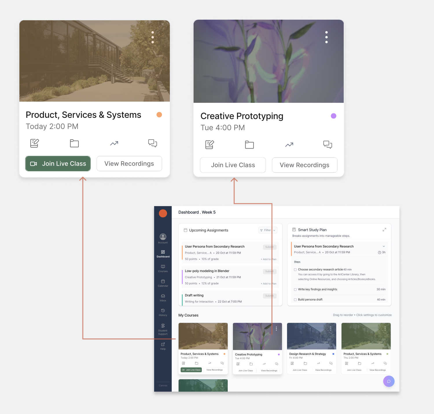
Upcoming assignments are placed on the right side of the dashboard, the area users ignore most, according to NNG's F-pattern research.
What I changed: Moved upcoming assignments to the top-left, aligning with natural eye movement.
Visibility of System Status - NN/g Heuristic

Finding 2:
🟧 Moderate — Students know what to do, but not how to start
Research and usability testing surfaced the same pattern: students feel overwhelmed not by the volume of work, but by the absence of structure around it.
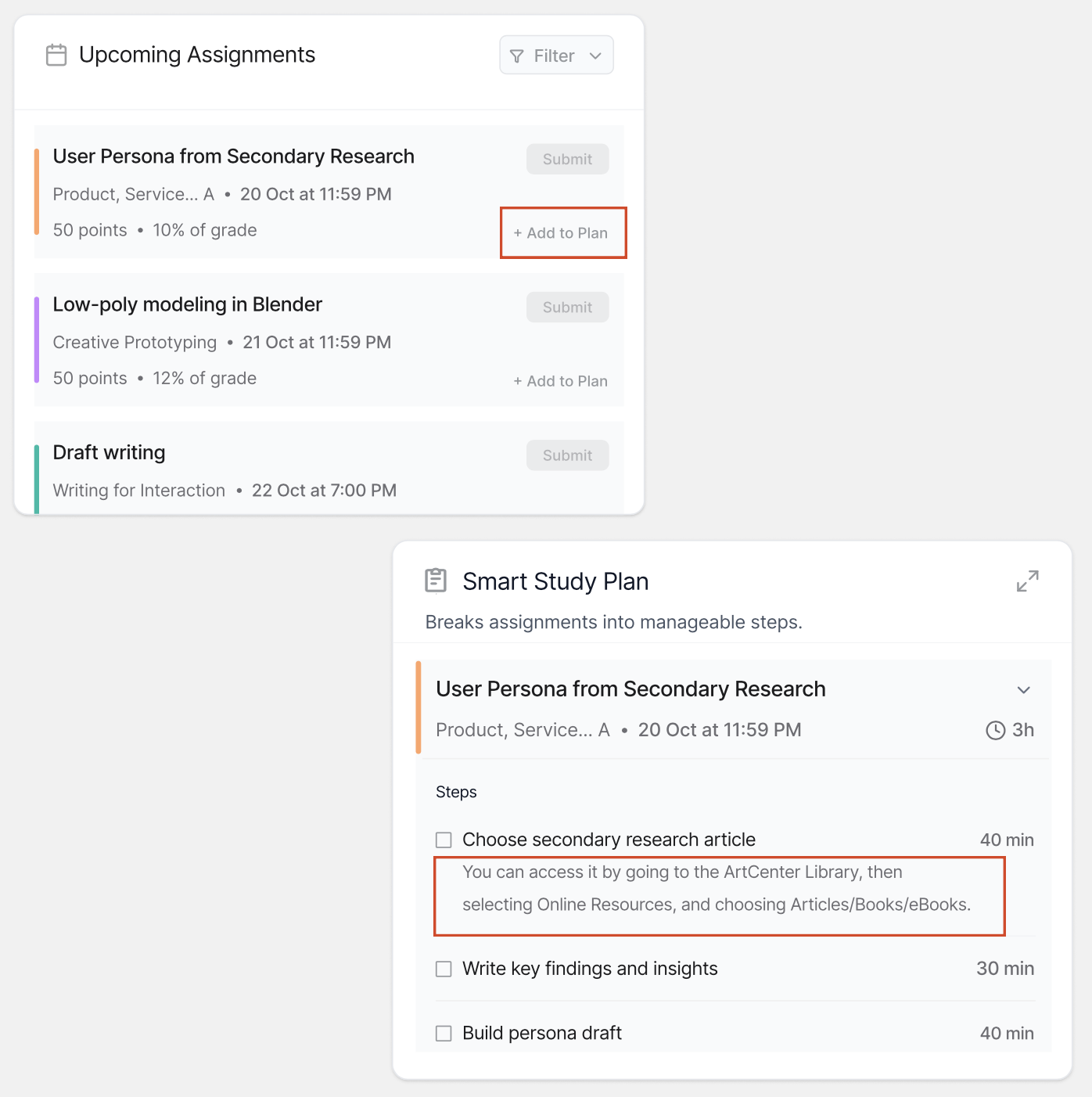
Assignments appear as single line items. No breakdown of steps, no time estimates, no guidance on where to begin.
What I changed: Designed the Smart Study Plan, breaks any assignment into step-by-step tasks with time estimates and actionable descriptions.
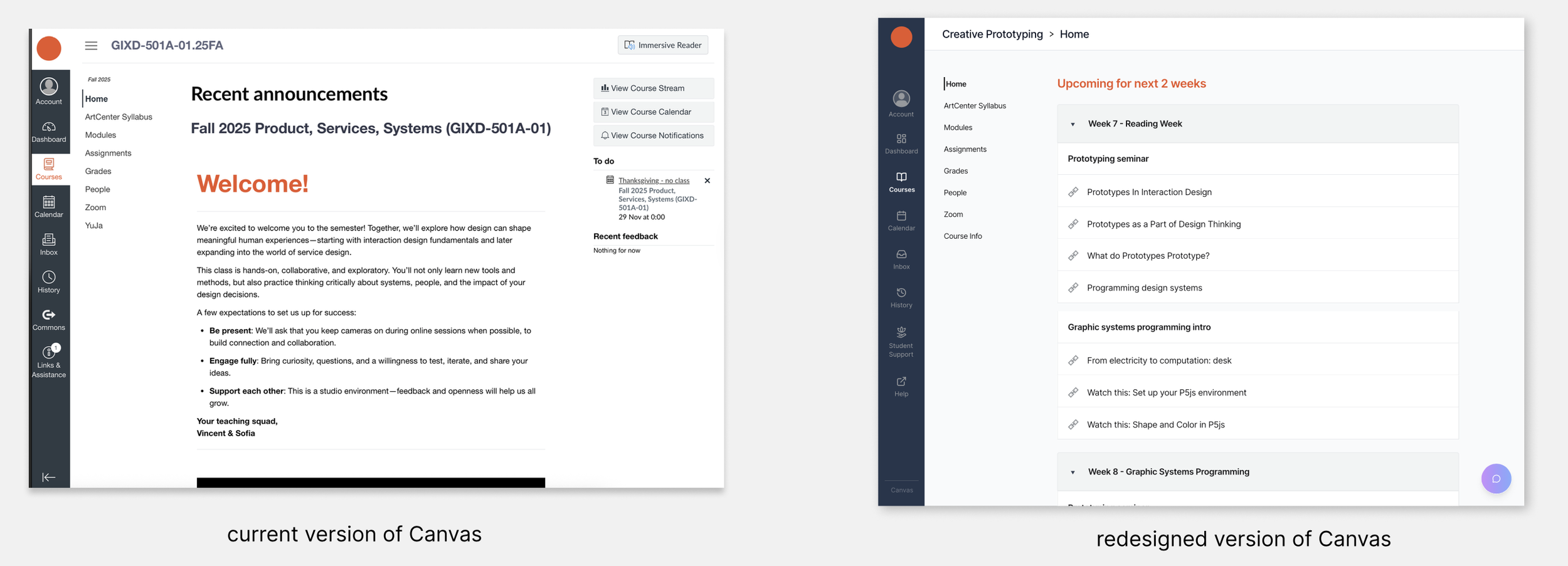
The course homepage showed a static "Welcome!" message, unchanged from week one to week ten.
"The term is moving ahead, but the page isn't. It just keeps welcoming us every time."
— Shruti, graduate student · usability testing participant
What I changed: Redesigned the course homepage to dynamically show what's coming up in the next two weeks.
Visibility of System Status & Match Between System and Real World - NN/g Heuristic

Finding 3:
🟩 Minor · High impact — Coursework feels disconnected from purpose
Students understood what to submit, but couldn't explain why a course mattered or how it connected to future opportunities. Secondary research consistently shows that students who understand the purpose behind their work are more motivated and engaged. Severity and importance are not the same thing.
What I changed: Added a Course Info tab to every course, explaining why the course matters, what skills students will develop, and what career paths those skills relate to.
Match Between System and the Real World- NN/g Heuristic

04 Usability Testing
Two participants. Specific, actionable feedback.
I tested the high-fidelity Figma prototype remotely via Zoom with one undergraduate and one graduate student. Both confirmed the core design direction. The more useful outcome was the specific feedback that led to concrete changes.
What they validated
Improved visibility and reduced clicks noticed immediately
Smart Study Plan reduced uncertainty on where to start
Overall interface felt clearer and calmer
What they pushed back on — and what changed
Smart Study Plan steps were too brief to act on → updated from short keywords to full descriptive phrases. For example: "Create Persona" became "Include user biography, needs, motivations, pain points, goals, and a day in the life"
Interface felt visually busy → simplified color palette, strengthened visual hierarchy
Suggested drag-to-reorder in Smart Study Plan → logged for next iteration
05 Outcome
Less searching. More learning.
The redesign addresses the three issues identified in research: accessibility, clarity, and applicability, through targeted changes that reduce friction at the most common and high-stakes student interactions.
3–4 clicks → 1 to join a live class
Every assignment now has a step-by-step breakdown with time estimates
Every course now explains the skills students will develop and how they connect to career outcomes

05 Reflection
What I learned and where I'd take it next.
What I learned
The harder problem wasn't finding information — it was knowing how to start
Accessibility goes beyond visual considerations — it's about making information actionable in the moment a student needs it
Severity and importance are not the same thing — a minor usability issue can have a major impact on motivation
What I'd explore next
Expand usability testing — especially with students with ADHD, who are most affected by Canvas's current information hierarchy
Prototype drag-to-reorder in the Smart Study Plan
Explore how the redesign translates to mobile