ASOPRS Foundation
Surgical Training Video Platform
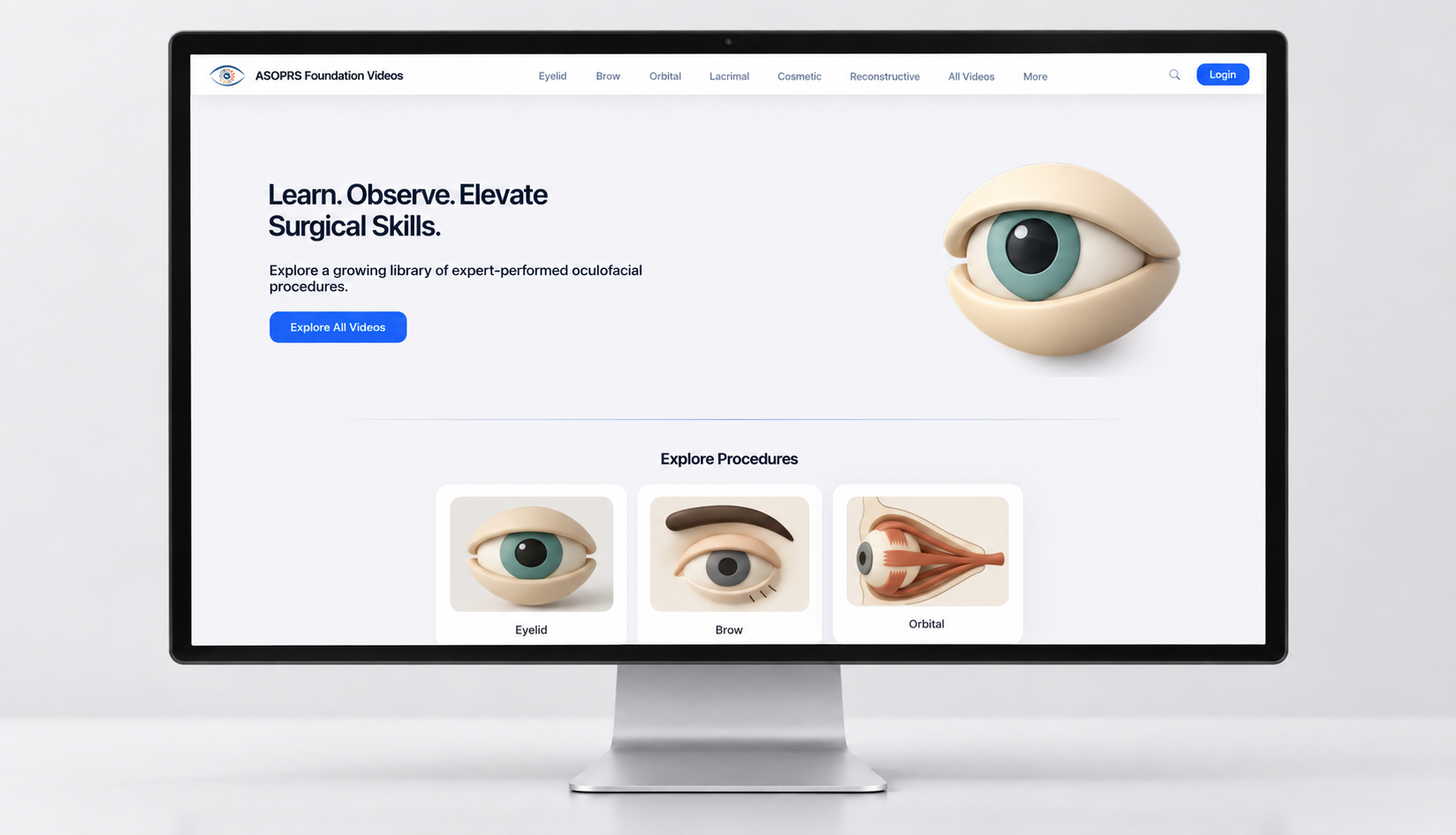
Designed a mobile and desktop video platform for oculofacial surgery trainees, with filtering and search to find expert-led surgical videos. The designs helped secure ASOPRS Foundation funding to build it, and the beta is now live.
Role
Sole UX Designer
Team
Project manager, 2 developers
Timeline
Jul 2024 - Jun 2026
Platform
Desktop & mobile web
Tools
Figma, WordPress, Asana
Summary
What is it: A video library where residents and fellows find surgical videos and compare techniques. Surgeons are potential contributors of videos.
My contributions: I led the research and designed the information architecture, user flows, wireframes, and desktop and mobile layouts. I also built the design system, defined the filter logic with the project manager, and prepared the handoff.
Design challenge. How might we help residents and fellows find and compare the right surgical video in seconds?
Goal: Create a searchable, filterable video library that the team could get funded and built.
Objective: Deliver the information architecture, desktop and mobile designs, and filter logic that developers could build from.
Impact: My prototype and designs helped secure ASOPRS Foundation funding, which paid for two developers. The beta launched in June 2026.
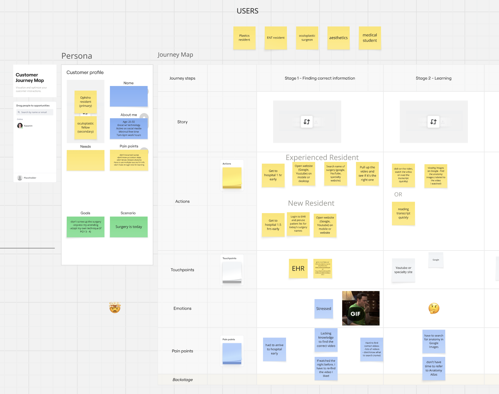
Four pain points
Finding the right video takes guesswork.
Residents search Google and YouTube by surgery name, don’t always know what to search, and face a large number of videos.
Time before surgery is short.
Residents arrive an hour or more early to prepare, often stressed.
Anatomy lives somewhere else.
They search Google Images for anatomy, with no time to consult an atlas.
Videos are hard to find again.
A video watched the night before has to be found again.
01 The Problem
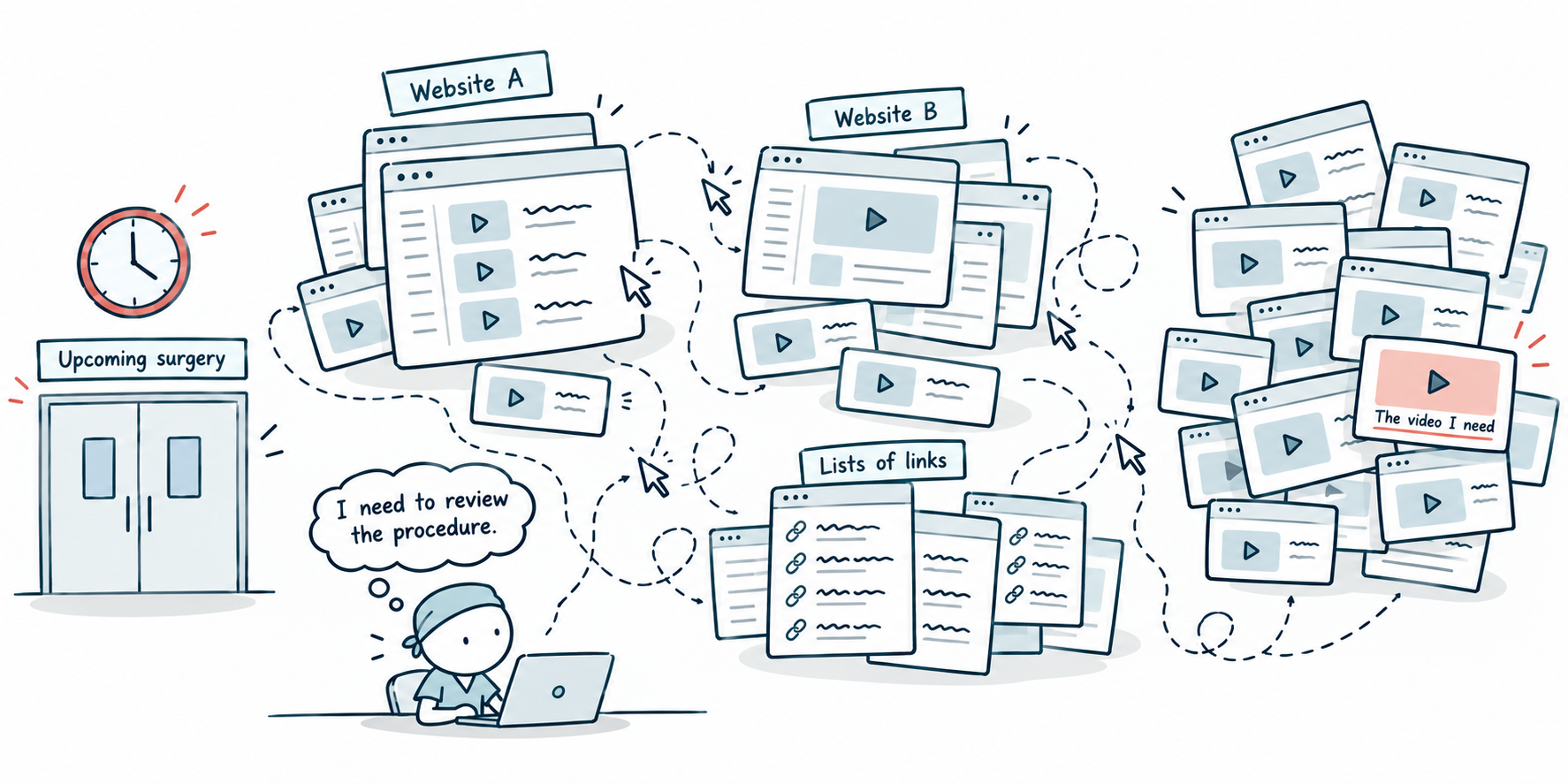
Preparing for surgery, with videos scattered everywhere.
Residents and fellows watch surgical videos to prepare before they go into surgery, but existing resources scatter videos across lists of links and other sites, with little search or filtering. Finding a specific procedure takes many clicks, and preparation time is often short.
02 Project Journey
From a live prototype to a funded build.
I started on WordPress. The project was small, and a live site was the fastest way to test the idea with real users and stakeholders.
Over about four months, the requirements changed. The team planned far more video, and the product needed advanced filtering and search. On WordPress, basic features like filtering needed paid plugins, and some couldn’t be customized. Each new feature added cost and another dependency on someone else’s code.
I recommended a custom build, with a developer working in parallel with my design. There was no budget for a developer, so I proposed using the live site to pitch funders.
WordPress prototype
I designed and built a live site to test the idea
Scope grows
More video, plus advanced filtering and search
The pitch
My live site became the funder pitch
First funding
Paid for the first developer
Rebuilt in Figma
New research and brand, desktop and mobile
Second funding
Added a second developer
Beta launch
June 2026
03 Research
Talking to the people who prepare for surgery.
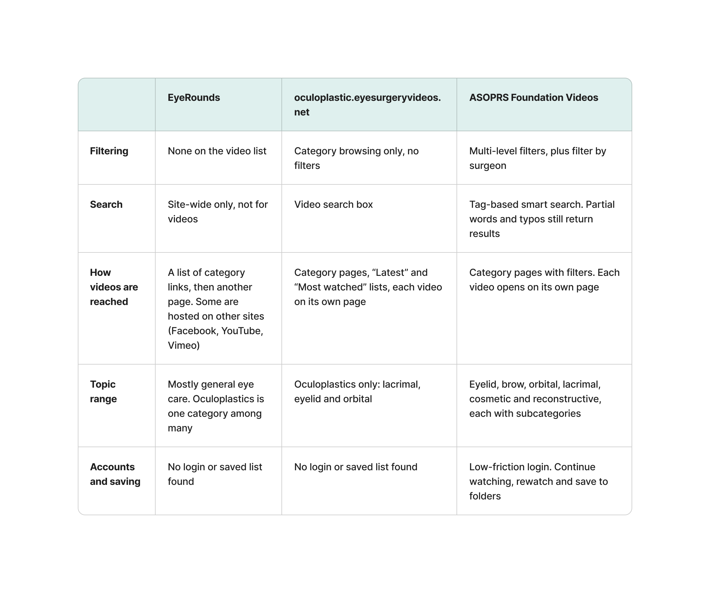
I interviewed 10 people: 8 residents, 1 surgeon and 1 stakeholder. I also compared two existing resources, EyeRounds and oculoplastic.eyesurgeryvideos.net.
Competitive analysis
Neither resource let users combine filters, and I found no way to save videos.
Competitor sites reviewed in July 2024
What I found
Residents prepare on the day of surgery, under pressure.
Led to: a mobile version and a low-friction login.
Finding a video depends on knowing what to search.
Led to: tag search and clear categories.
Anatomy is searched for separately.
Led to: anatomy images designed alongside each video.
Videos are hard to find again.
Led to: save-to-folder, continue watching and rewatch.
Existing resources made videos hard to reach.
Led to: multi-level filtering and direct access.
04 Design Process
From pain points to a focused first release.
Framing the problem
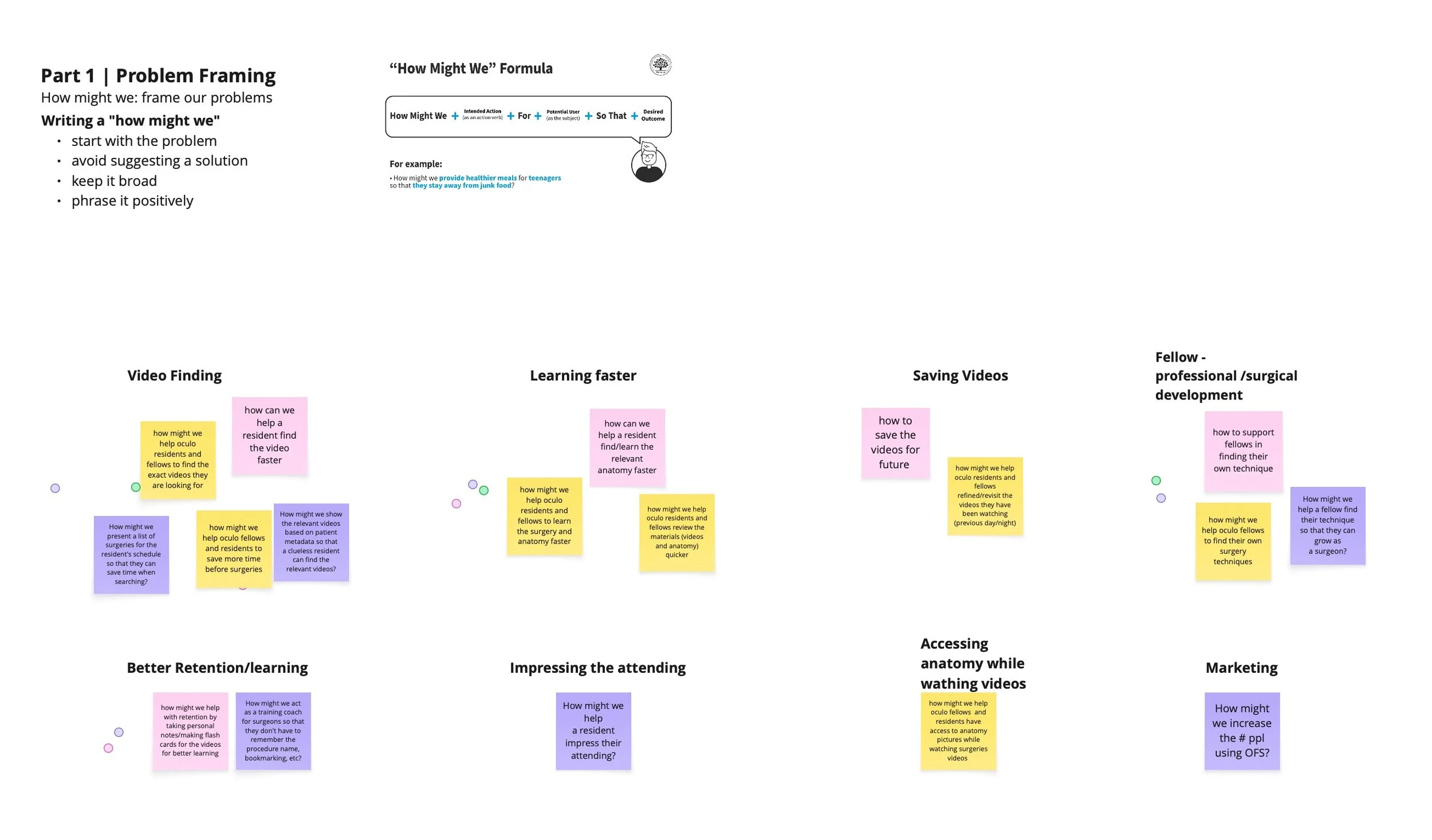
I turned the pain points into “How might we” questions across eight themes: video finding, learning faster, saving videos, surgical development for fellows, better retention, impressing the attending, accessing anatomy while watching, and marketing.
Ideation
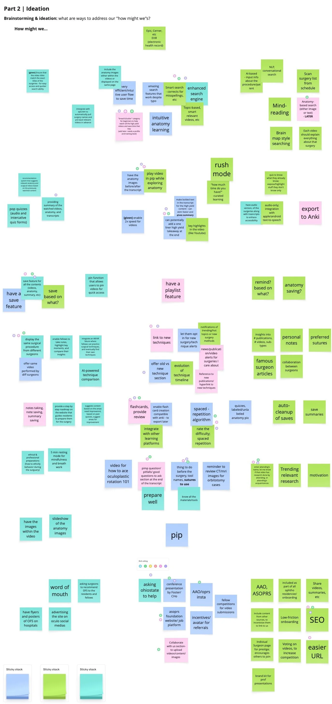
I generated ideas for each theme, from rush mode and picture-in-picture video to playlists and flashcards that export to Anki.
Prioritization
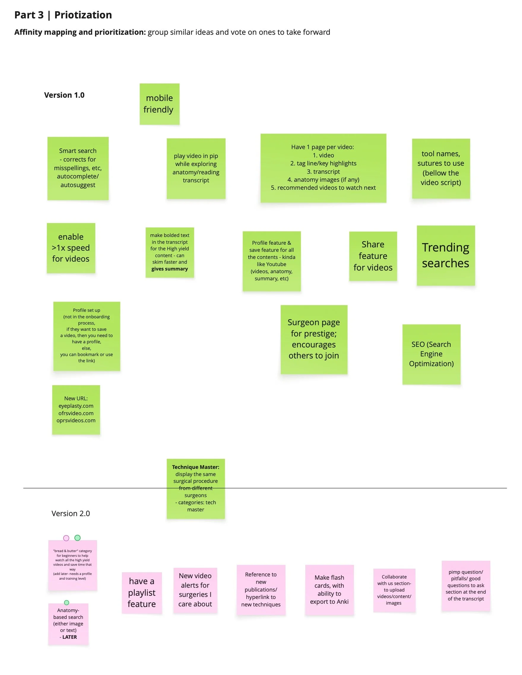
I grouped similar ideas, voted on which to take forward, and sorted them into Version 1.0 and Version 2.0. That kept the first release focused on finding and preparing for surgery.
Version 1.0
Mobile-friendly design/Smart search/Surgeon page
Version 2.0
Playlists/New-video alerts/Flashcards with Anki export
05 Solution
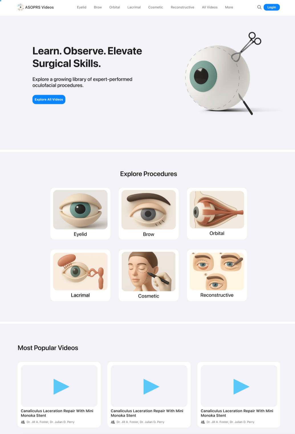
I designed a platform where residents and fellows can find the right surgical video in a few steps and come back to it later. It has multi-level filtering, tag search, a homepage for returning users, and video pages designed with anatomy beside the video, on desktop and mobile.
Information architecture
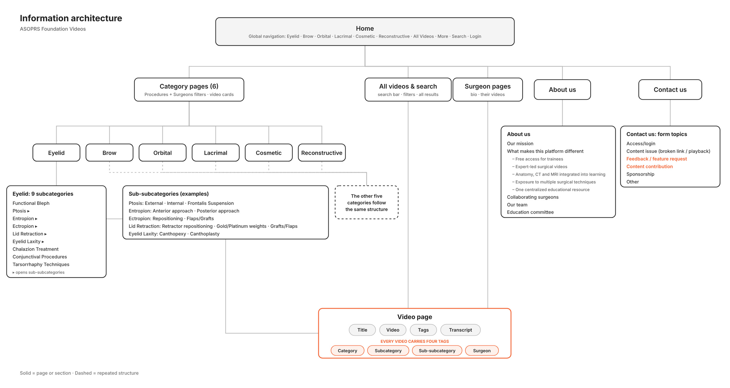
Every video carries four kinds of tags: category, subcategory, sub-subcategory and surgeon name. The same tags drive the navigation, the filters, tag search and the video page, so users see the same labels everywhere.
The tag names came from stakeholders in a spreadsheet, since they’re technical medical terms. I designed the structure and how tags appear, using real tags and examples from the interviews on every screen.
Key decisions
1. Multi-level filtering
The problem:
Residents arrive knowing the procedure they need, but existing resources made them click through lists of links to reach it.
The decision:
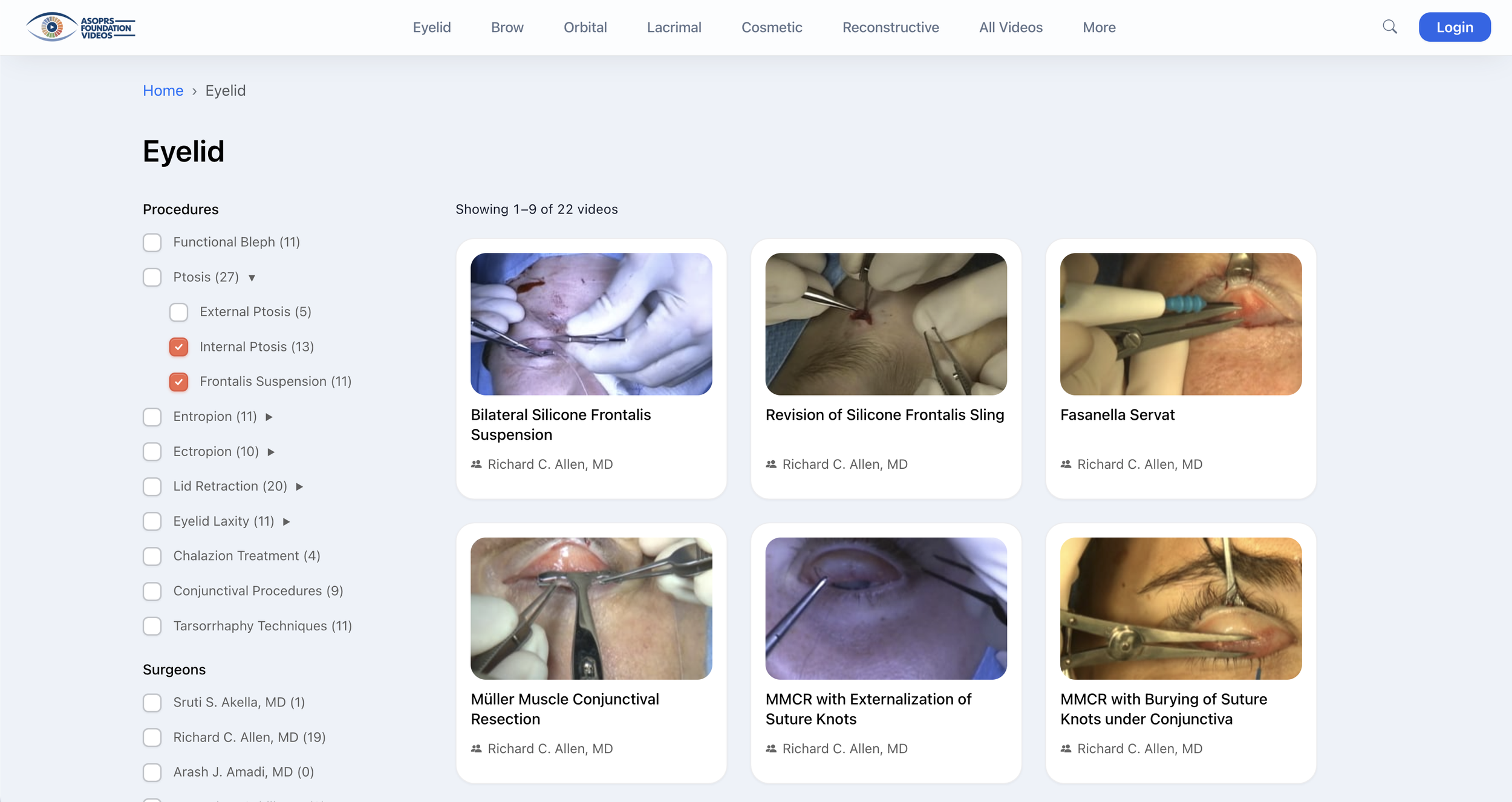
Every category page has filters for subcategory and surgeon. Residents can narrow a long list to the right video in a few selections, and each video opens on its own page.
The filter rule:
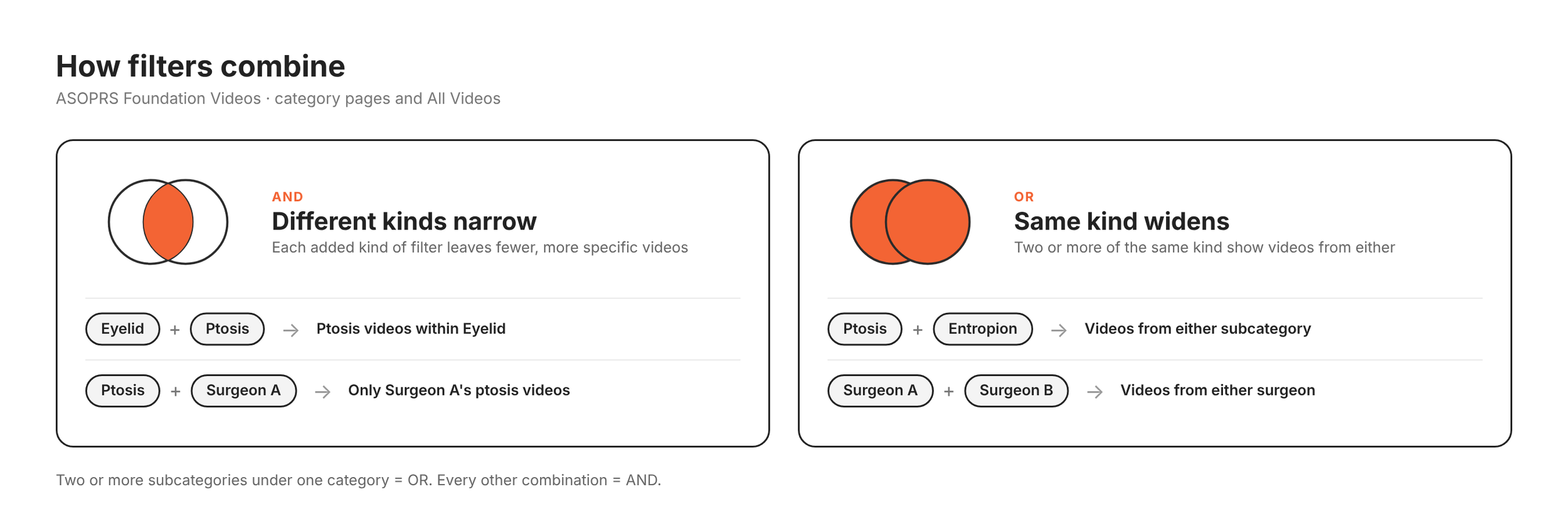
- Different filters narrow the results: a category plus a subcategory, or a subcategory plus a surgeon.
- Two or more of the same kind widen them: two subcategories, or two surgeons, show videos from either.
Why:
Preparation time is short, so fewer clicks to the right video matter more than a large library. Narrowing across filter types gets a resident to one video fast, and widening within a type lets them compare techniques or surgeons.
2. Tag-based search
The problem:
Residents prepare under time pressure, so they can’t afford a search that returns nothing because of a typo or a half-remembered name.
The decision:
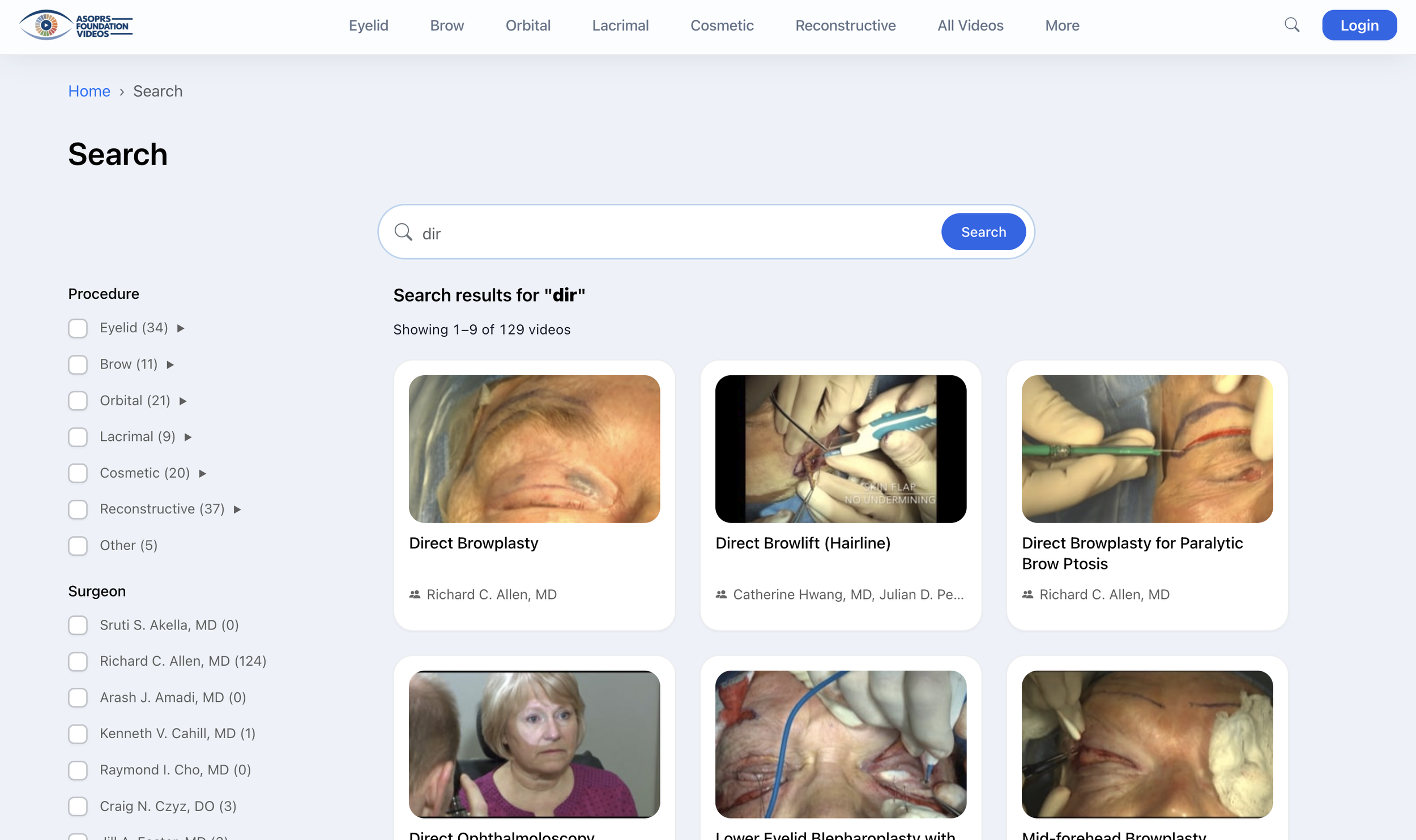
Search reads all four tags, so a partial word, a typo or an incomplete name still shows relevant videos. The search icon opens the All Videos page with every match.
Why:
A resident who half-remembers a procedure name still gets video options, not an empty page. The same tags drive the filters, so searching and browsing give consistent results.
3. Returning-user homepage
The problem:
Residents often watch a video the night before surgery, then need to find it again on the day. Re-finding a video meant searching again from scratch, and time was short.
The decision:
When a resident logs in, the homepage puts their own videos first:
- Continue watching picks up where they stopped.
- Rewatch brings back videos they’ve already seen.
- Saved folders let them keep videos they want to return to.
Login is kept low-friction, so signing in doesn’t cost the time it’s meant to save.
Why:
For a resident preparing under pressure, the fastest video to reach is one they’ve already chosen. The homepage turns the first visit’s work into a shortcut for every visit after.
4. The video page
The problem:
On the day of surgery, a resident watches or skims a video, then looks up the anatomy in Google Images because there’s no time for an atlas. Anatomy and video lived in different places.
The decision:
Each video opens on its own page with the title, the video, its four tags and a transcript, for residents who read instead of watch when they’re short on time. I also designed anatomy reference images alongside each video.
Where it stands:
The beta has the video, tags and transcript. The anatomy images are in my design and not yet in the build, because the stakeholders supply them.
Why:
A resident should be able to confirm it’s the right video, check the anatomy and skim the steps on one page.
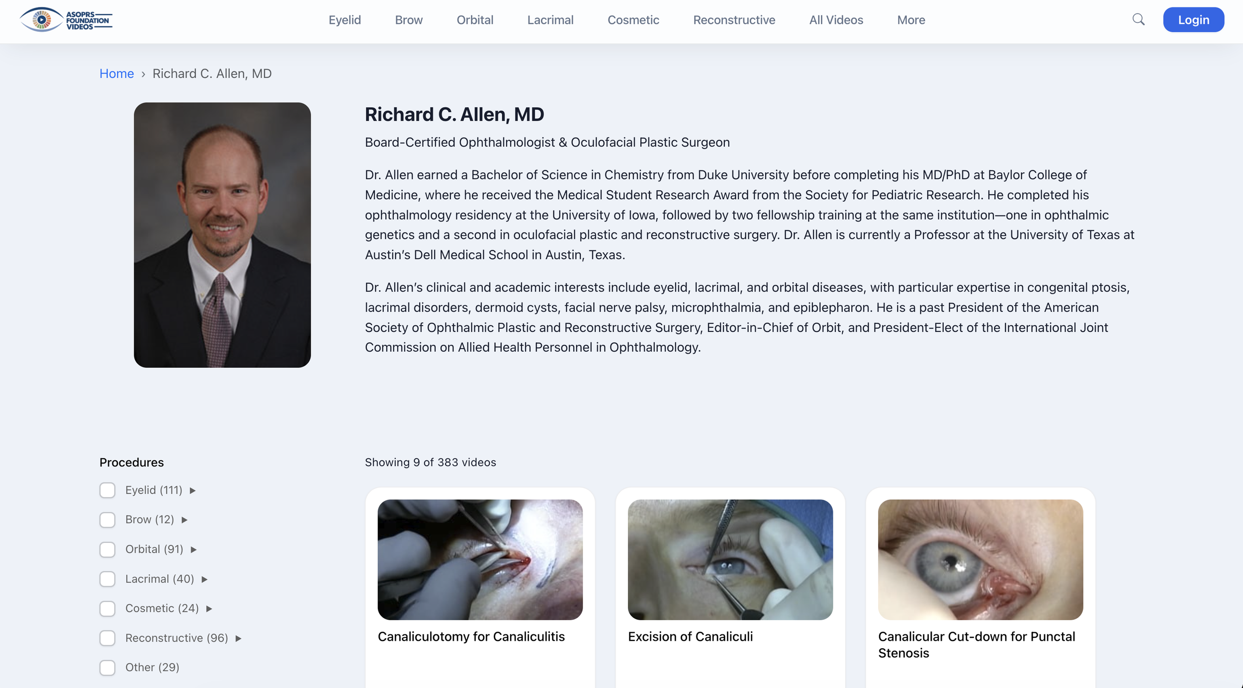
5. The surgeon page
Each surgeon has a bio page. It adds credibility to the videos and leaves room for surgeons to contribute their own work later.
6. No coming-soon page for Collaborate
The problem:
A “Collaborate” button for surgeons was proposed, with a coming-soon page behind it until the feature existed.
The decision:
I recommended against it, and proposed a suggestions channel in Contact Us plus a short note on upcoming features.
Why:
Surgeons are busy and visit rarely. If they find a dead end for months, they learn the button leads nowhere, and undoing that habit later costs more than never creating it.
06 Handoff
From Figma to a working build.
I walked the project manager through each design in working sessions. She shared the documents with the developers in Asana and assigned the work, and the filter logic went the same way.
The developers built on Bootstrap, so I specified custom sizing wherever my designs differed from the defaults. I chose the icons, stakeholders supplied the anatomy images, and volunteers uploaded the surgical videos to Vimeo.
07 Outcome
A funded platform, live in beta.
My prototype and designs helped secure ASOPRS Foundation funding, which paid for two developers. The beta launched in June 2026.
Testing showed the home button was missing, so I added it. Users liked the mobile layout and asked for bookmarking and new-content notifications.
Next steps include collaborations with surgeons who want to share their videos on the platform. I also suggested bringing AI into the site.
08 Reflection
The tool is part of the design.
I started on WordPress because the project was small and a live site was the fastest way to test the idea. As the features grew, WordPress became the limit. Moving to Figma, with a developer building from my screens, turned the design from what the platform allowed into what residents needed.
The early version still mattered. It became the pitch that funded the developer, and that taught me a working prototype can move a project further than a plan.